Imagine your clients receiving one of your real estate postcards, reading it front-to-back, top-to-bottom, and then calling you for a consultation. Creating postcards that get that kind of reaction is both an art and a science. That’s where we come in!
With nearly 50 years of design experience, here are some of our best practices for optimizing the back of your 4″ x 6″ real estate postcards. From photo formats to font recommendations, you’ll find practical and useful information.
6 Design Tips to Optimize the back of your Real Estate Postcards
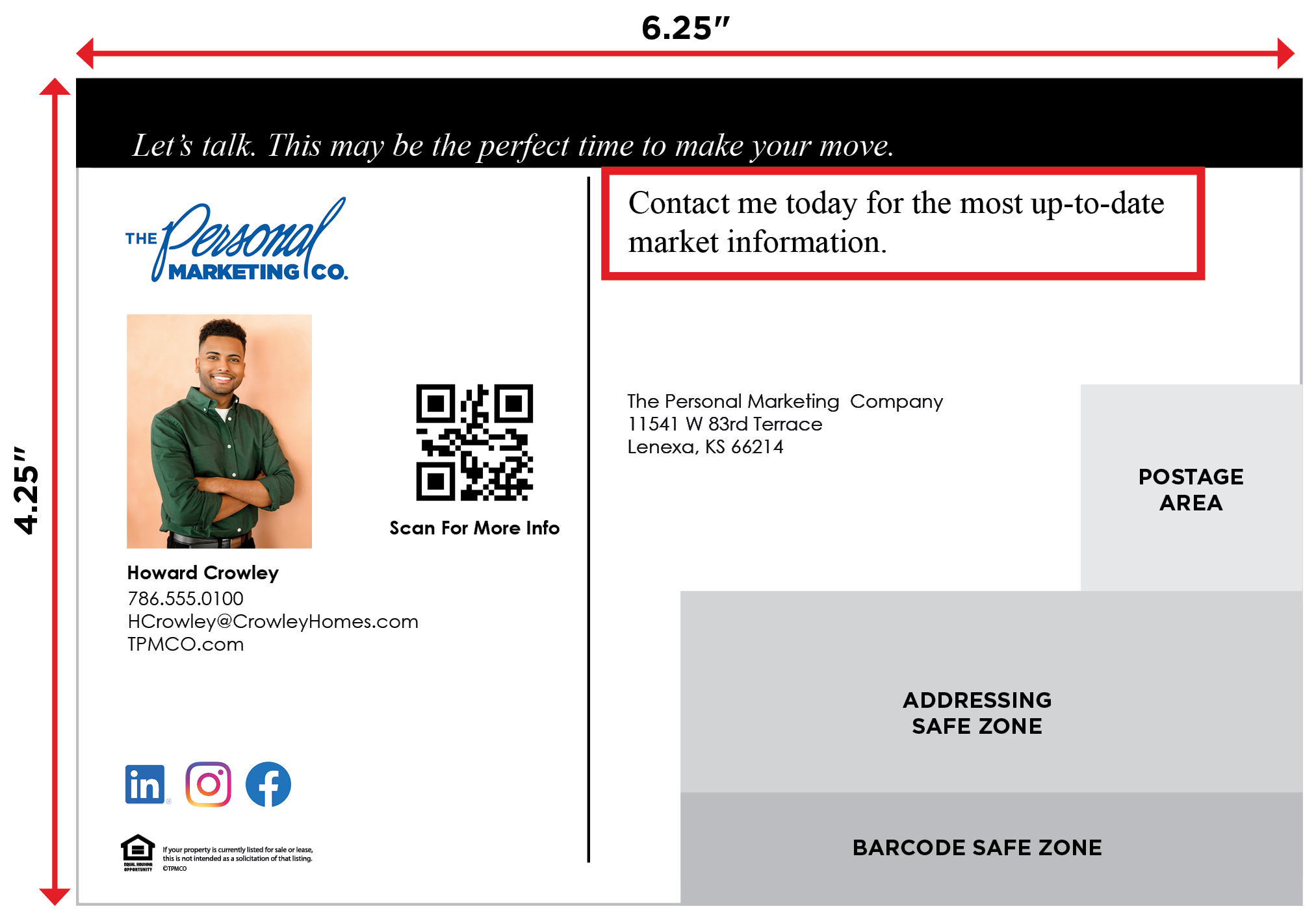
Tip 1: Headline and Copy
- Stick with short, to-the-point messaging for clear comprehension.
- Leave at least 0.5″ to 0.75″ of space between all copy elements.
- Aim to have copy take up about 20% to 30% of the surface area of the postcard.
- Secret Designer Pro Tip: Don’t be tempted to fill in every bit of empty space. White space is critical and helps direct reading flow so the recipient sees what you want them to see.
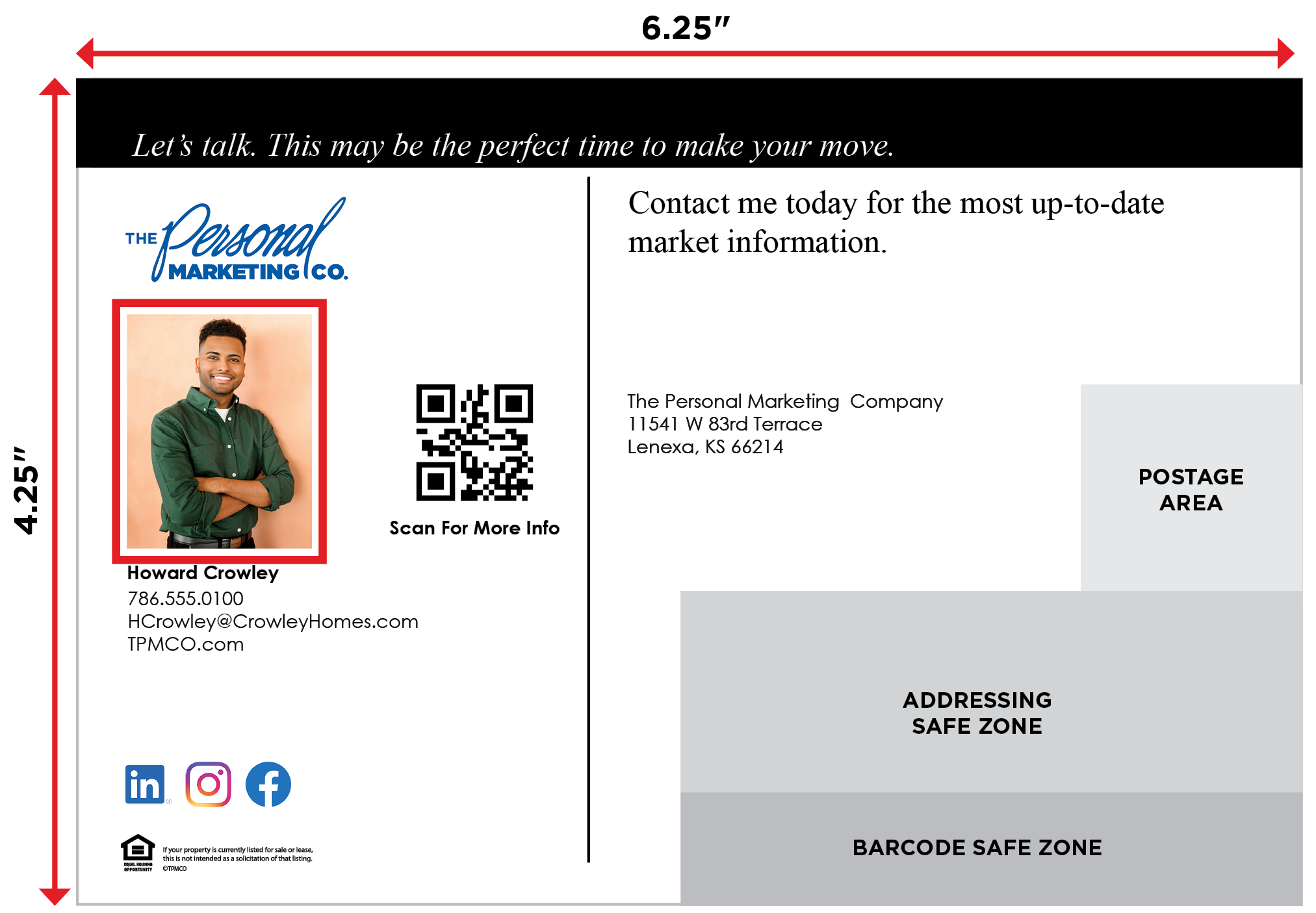
Tip 2: Including Pictures and Images
- Save and upload your photo as 2″ x 2.5″, high-resolution JPG, TIFF or PDF format.
- Keep all eyes on you by using an eye-catching headshot of yourself.
- If you prefer an image with a cut-out background, ensure your headshot is taken against a solid background color.
- Ensure the photo is clear on the real estate postcard proof. If it’s not, it won’t be clear on the printed piece.
- Secret Designer Pro Tip: If possible, position your headshot so you’re facing slightly toward the text. This subtle composition technique directs the recipient’s eyes to your important message.
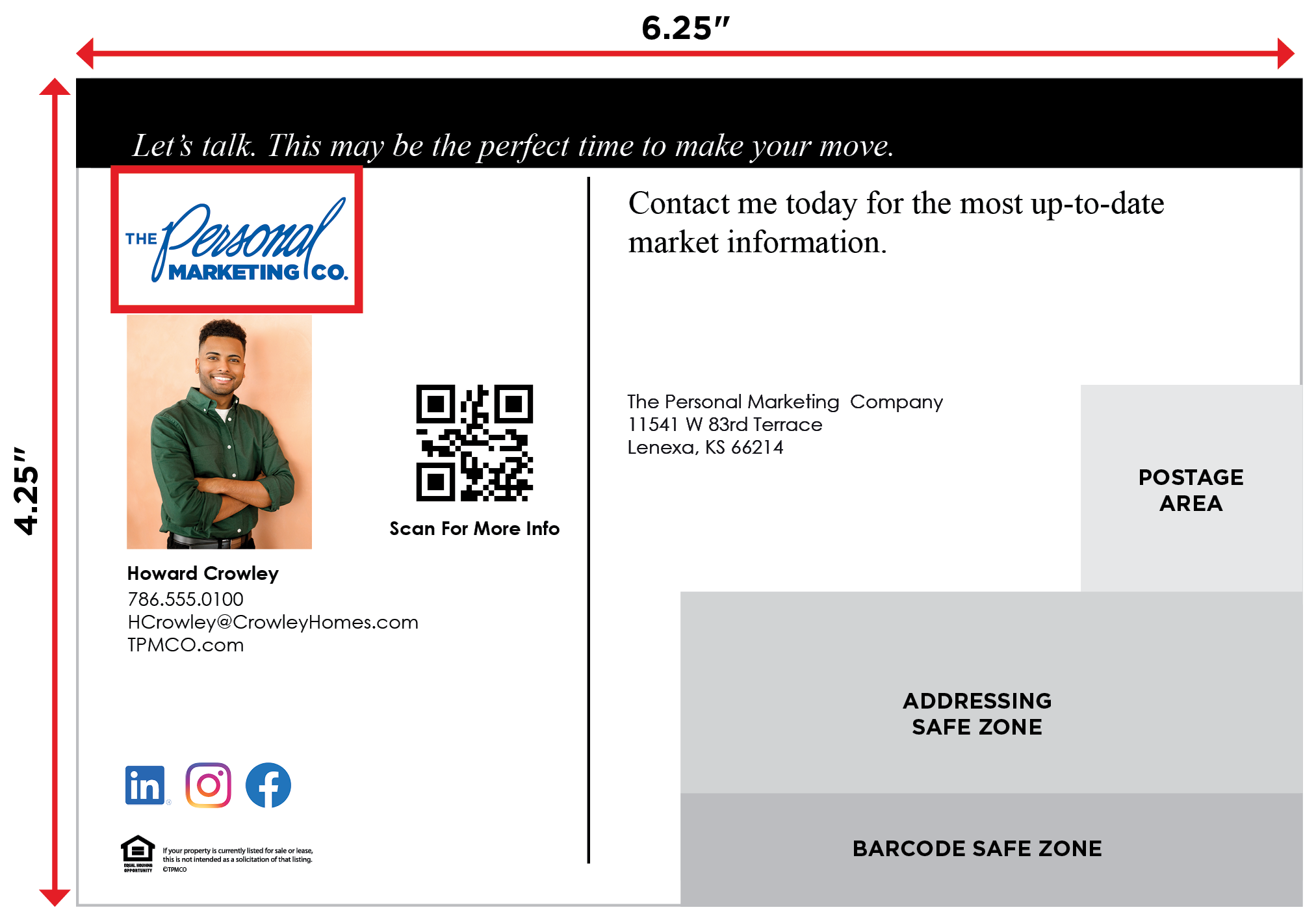
Tip 3: Logo Usage
- Save and upload your logo as a 2″ x 2″ to 2″ x 2.5″, high-resolution JPG, TIFF or PDF format.
- Keep your logo small to avoid overwhelming your photo but large enough to be recognizable.
- Use a version of your logo that’s compatible with the other colors on the card.
- Secret Designer Pro Tip: Make sure there’s ample white space around your logo so it stands out but doesn’t overpower the design.
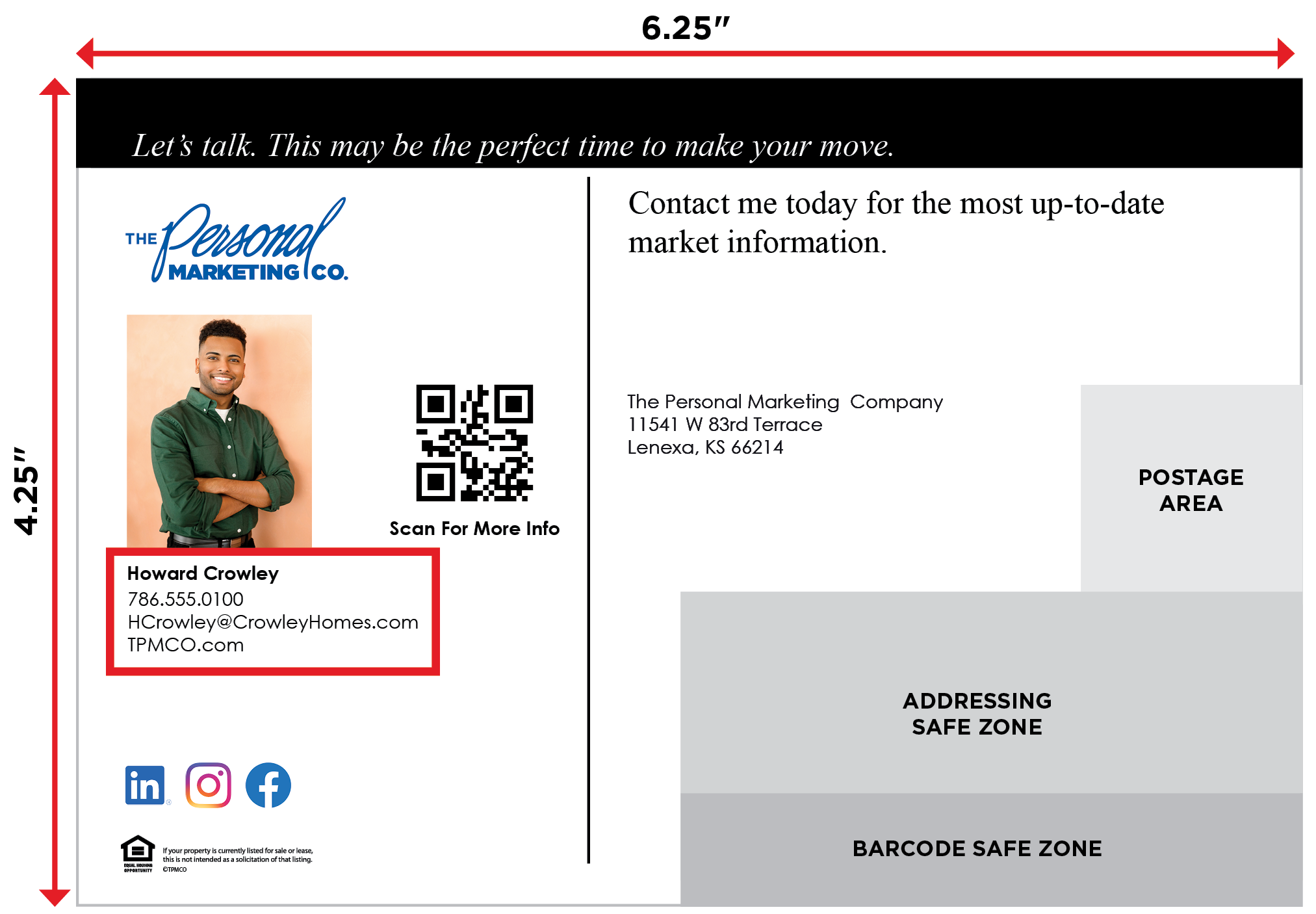
Tip 4: Contact Information Placement
- Include important details such as your phone number, email, website, and social media handles.
- A good rule of thumb is just that, to leave about a thumb’s width of space in between the contact info and other design elements.
- Secret Designer Pro Tip: Add a little extra space between each contact detail to keep the text clean and ensure readability.
Tip 5: Font Recommendations
- Headline — use bold, easy-to-read fonts like Futura or Gotham
- Body text — choose a simple and readable font like Arial or Helvetica
- Contact info — keep the font professional and consistent, around 8–10 pt, and use the same font family as the body text for uniformity.
- Avoid script or overly decorative fonts for important information to maintain readability.
- Secret Designer Pro Tip: Vary the weights of your fonts to direct the reader through the copy. Make headlines and sub-headlines bold. Use semi-bold to highlight important information.
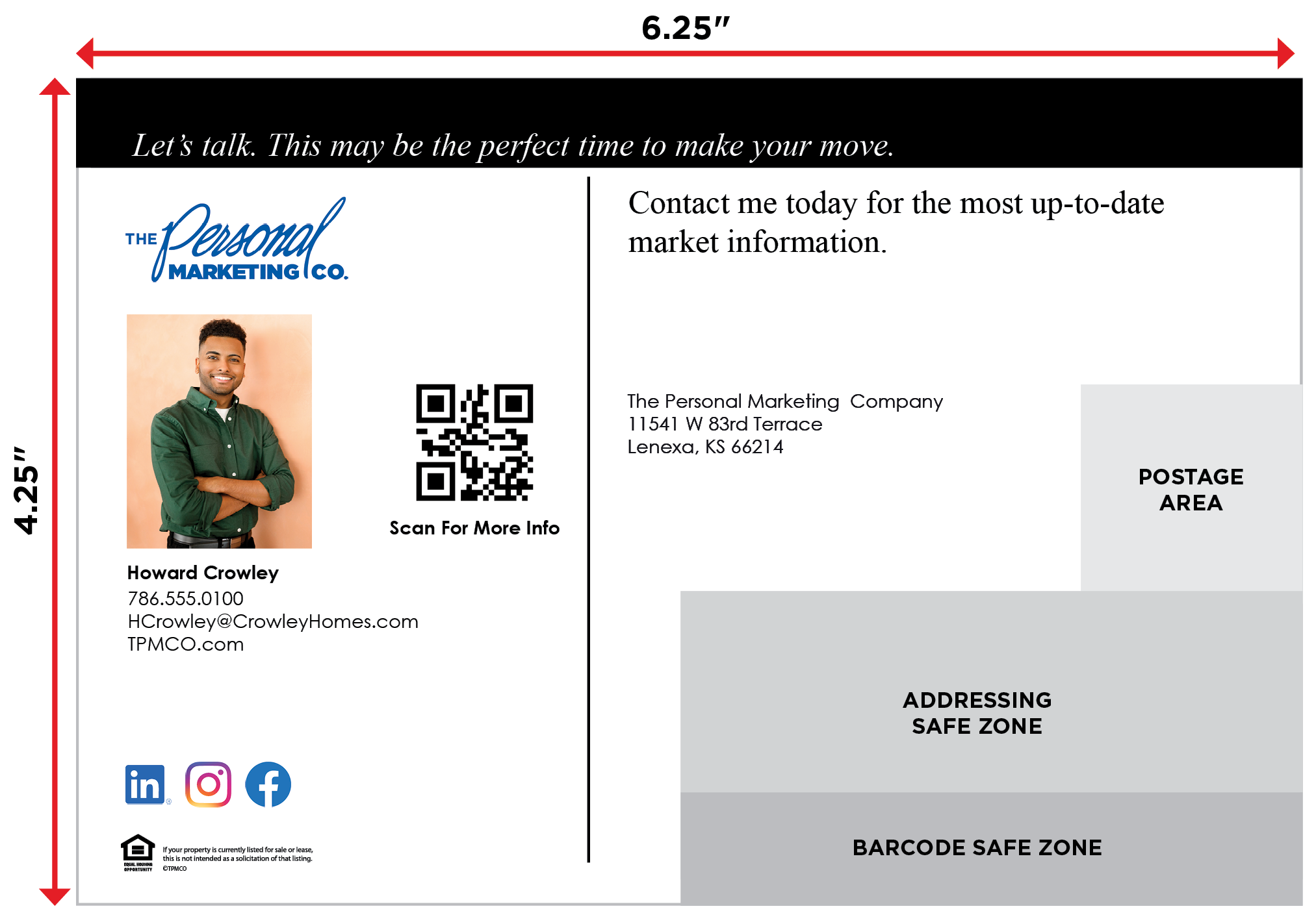
Tip 6: General Design
- Use a maximum of 2–3 different fonts to keep the design cohesive.
- Maintain a clear visual hierarchy by varying font sizes for headlines, body text and contact details.
- Leave at least a 0.125″ margin around the edges to prevent cutting off any elements during printing.
- Aim for a balanced, uncluttered design that guides the reader’s eye smoothly through the content.
- Secret Designer Pro Tip: When you have everything the way you want it, read your copy out loud. You might hear a mistake that your eyes didn’t see.
Whether you design your own real estate postcard, or choose to utilize one of our templates, you are on the right path to staying in front of your clients and SOI. We have a full team of customer support and creative designers to help you lock down a real estate postcard design that highlights YOU. Reach out today to learn more!
